It's a new year, and that means new chances for new babies to join my circle. Some of those babies will get quilts I've already made, but at least one of the hoped for arrivals (for whom I am jumping the gun) is going to get something not yet made.
As expected, it started with a quilt top (found via Pinterest). As I learned at Linda's Quiltmania, this quilt is from, and featured on the cover of, Beyond Neutral by John Q Adams.
The shapes of blocks -- my husband calls them arrows, I think they look almost like fish -- are appealing to me, as is the scattered pattern. Another thing that draws me to this quilt is the more unusual solid choices used by the makers, bold blues instead of a traditional white or the often seen black or gray.
I don't have access to that book through my local library, and can't justify buying it right now, so I'm going to use the pictures as inspiration and figure out something similar based on the size of quilt I want, and the size of precut fabrics I'm working with. This might end up being more work in the long run -- quilt math hasn't been kind to me in the past -- but I have time to do sketches and calculations. And these are much more easily put away when my limited time is up...
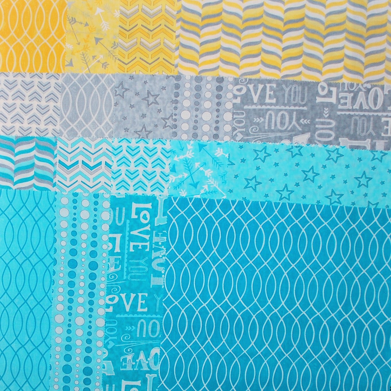
From a layer cake of Hugaboo fabric I picked up specifically for this hopeful-baby, I started pulling choices, beginning with the yellows, grays, and aquas.
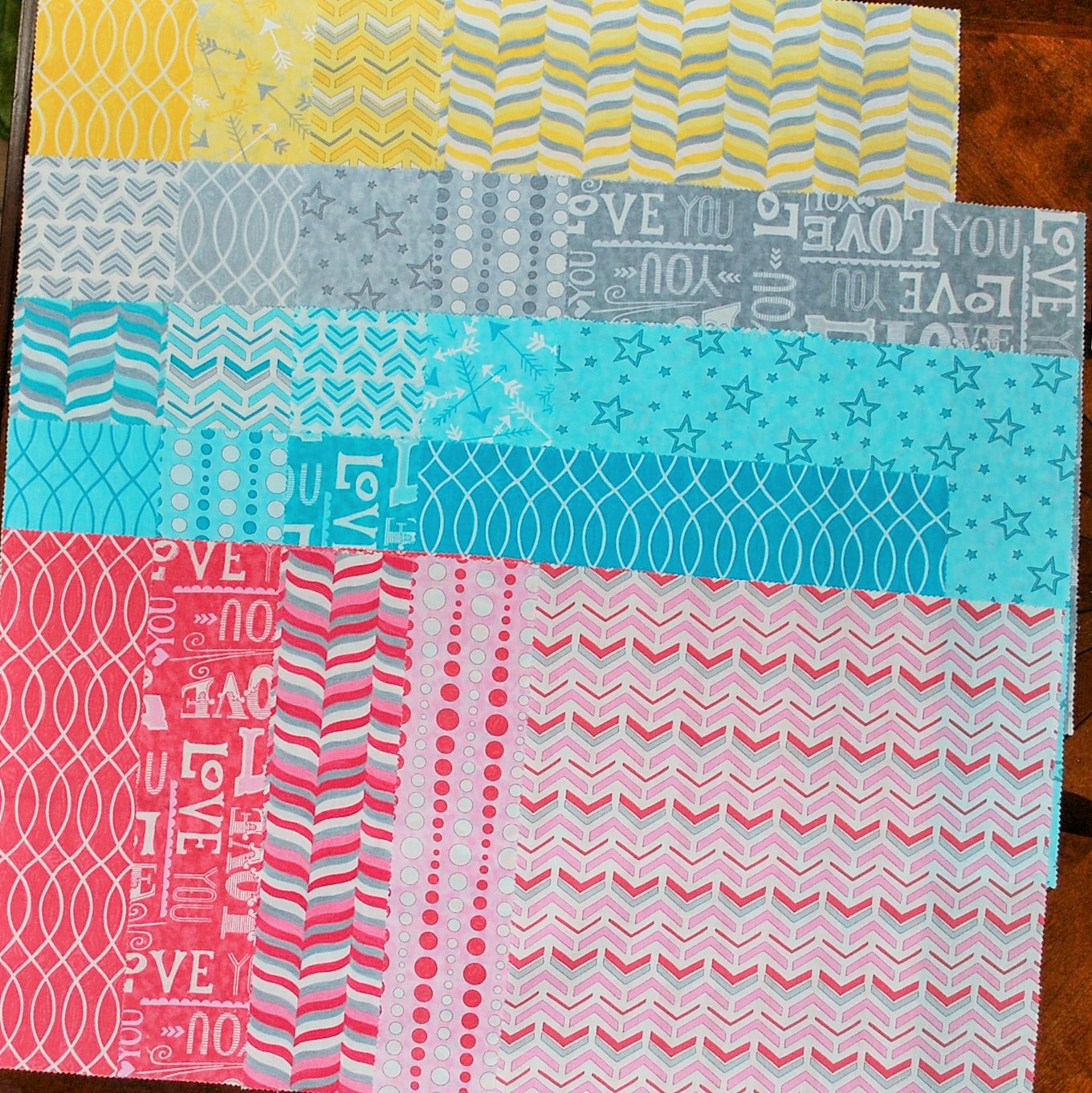
I could add in a couple of the dark red prints:

Or, depending how long this top takes, I could add some reds and pinks:
I think the best course of option is to plan on the yellow/gray/aqua. My mock ups didn't include a light vs dark aqua option, and that might make enough difference I won't find I need the red. That said, to keep my options open, I think I had better pick a background fabric that plays nicely with at least that darkest red, and maybe make a couple blocks with it so I can see in person whether it's needed or not.
Decisions, decisions....
The hard part was always going to be choosing a background fabric. Not knowing whether I'll be including red/pink or not makes it even harder!
I need a solid (ish) for the background. I know part of what attracted me to the inspiration quilts -- but I'm not sure I can go that unusual, especially with the colors I've chosen to work with!
I whipped up a quick mock up (in part to play around with layout of the arrows) and wound up playing a little with background options.
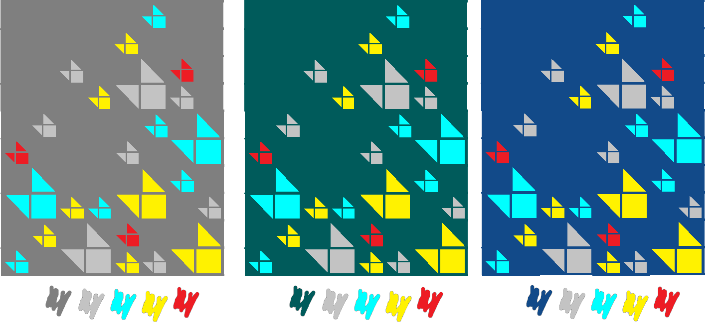
Taking out the red:

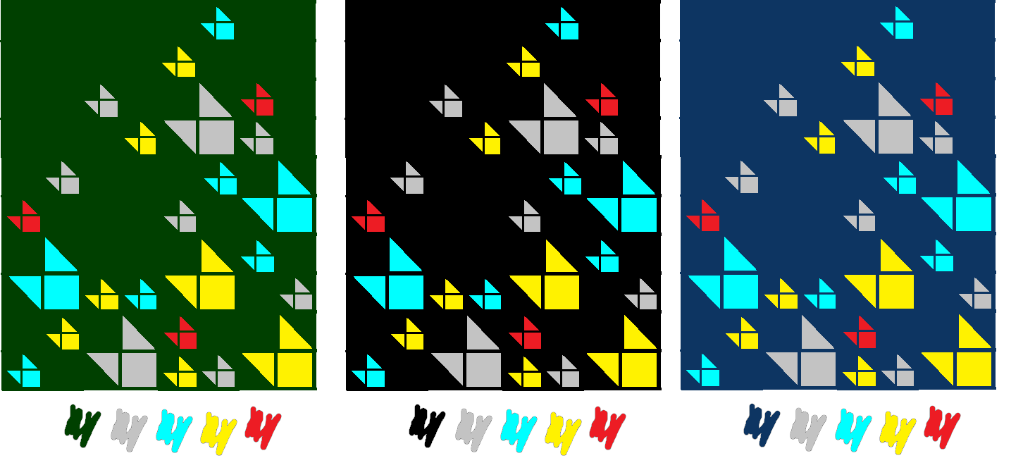
I could go really unusual:

Ugh.
I can see a trip to the fabric store is in my future. I think I'm leaning towards the deep teal color, but if nothing seems perfect, I might just go with the gray so I can get started. Decisions, decisions!
No comments:
Post a Comment