While the internet was down and the house was too hot for anything productive, I pulled the pink/red quilt top, the camera, and any piece of fabric I thought might possibly work into the bedroom for some serious auditioning.
I tried a lot of fabric. Pinks, reds, blues, yellows, browns, aqua, dots, stripes, animals, characters, gingham...
I started out with the ones I had the highest hopes for:
... the dots look fairly orange next to the reds already in the quilt...
... the colors actually work fairly well, but I'm not sure the prints go together...
... I was saving this one for the back. Actually, it doesn't look so bad in the photo, though I didn't think it worked quite so well in person. Hmm... I may have to try this pairing again under different lighting.
Then I got a bit more desperate and tried a lot of weird things. Most of which did not work, but some of them... well... they were closer than I expected...
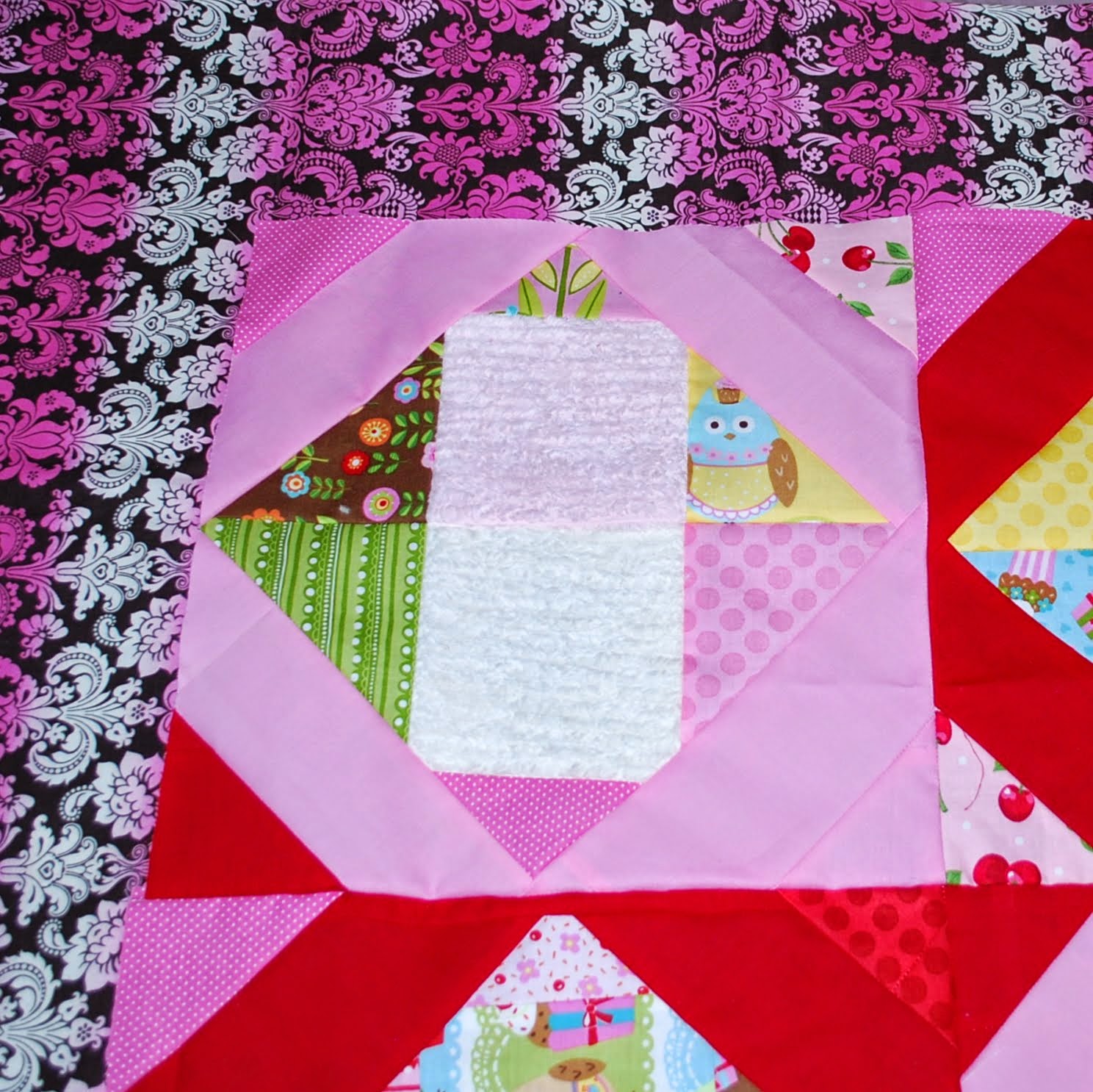
... Not quite right, but I do like the almost coordination with the red, green, and blue cupcake liner like stripes in the top already...
...Color-wise, I actually really like the above pairing.
But - I don't like the prints together. It just clashes for me...
...I thought I'd try something relatively toned down, but it seems too toned down to me. Although again, this set looks better in the photo than I recall from real life. Maybe I should check it again too...
...I even got a little desperate and pulled a couple owl prints from hiding (as my husband loves them and wants me to horde them for the possible future)... The blue/aqua is too bright, and the types of owls clash, but it's close...
This is not my idea of fun. Also, I am not very good at it. There are people who are, and I am utterly jealous.
In increasing desperation, I tried a few more options, and came away with what I think are the two best options thus far:
I had completely forgotten about this print - which I had originally intended to use for kitchen curtains before deciding they were a little too delicate for our kitchen. I actually like it here, but I wonder if it would make a better back - even though I generally shy away from using much white in a back. It does introduce purple, which hasn't really been used in the top yet but still feels like it belongs, as well as using enough red, pink, and yellow to feel like it coordinates.
This is my next favorite, I think. But again, I feel like the colors are working together (it's hard to tell here, but the background is actually brown) while the prints aren't quite so complimentary. I liked it better in person than I do looking at this photo now. Crud.
My gut feeling after over an hour of looking at fabrics from my stash? I've got a couple I could look at again, but nothing that feels
right. Input from others thus far was to use one of the not-red, not-pink colors for the border, but unless it's a perfect match (which I do not have), I'm not feeling it. I really would like to see it with a red/pink print that's equally intense, or something in the perfect shade of brown. So I guess I'll be taking this little top in progress to the fabric store for some speed dating... At least if all else fails, I've got a couple things here that I can look at again.
But yes, this has really driven home the point that I have a lot of fabric I don't know what to do with. And some of it is really ugly. Also, that I need to try building a quilt from scratch without the help of a premade package to keep pushing me to develop a better eye for what goes together.


No comments:
Post a Comment